To that end, I'm sharing notes from our weekend shoot, even though (a) the pix aren't great and (b) the formality of these observations may appear a bit silly. Yes, we're just taking pictures, but a formal writing mode helps me organize lessons I hope to internalize through practice.
What's more, if you are also learning about night photography or, better yet, already a master of the genre, these tentative observations may inspire you join a conversation about creative camerawork in low-light situations. Here's where we are thus far:
Objective
Jenny and I hope to enhance our understanding of long-exposure night photos in which we selectively reveal objects by colored light illumination.
Materials
• Nikon D5000 - set for timed exposures
• Remote clicker - necessary to set precise exposure times
• Maglite flashlight with variable-focus beam - so far, our only illumination tool
• Gels - colored transparencies to add color to our exposures
• Stopwatch - to monitor exposure times
• Tripod - to reduce blurriness
Location
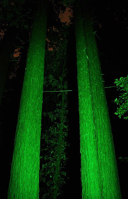
We photographed a grove of trees and an old wooden fence along Trout Gulch Road near Aptos, CA. During our shoot, the sky was foggy and the moon was hidden. Without car headlights, we experienced near pitch-black conditions. For safety's sake (and the sake of common sense) we parked off-road and avoided standing on private property.
Procedure
To place colored light where our camera would otherwise record nothing at all, we experimented with various apertures, time-lengths, flashlight "brush strokes," and focus techniques (this latter aspect being especially tricky at first). The following steps produced the most promising results:
1. Set the focus in the camera's auto-mode, aided by the direct illumination of your car headlights. Once you're sure of a relatively crisp image, switch to manual focus and turn off the headlights. Switching from auto- to manual-focus ensures that your camera won't adjust settings after you've dimmed the lights. You might ask: Why not simply keep the headlights on? Well, you can. But doing so diminishes the control you have over light-placement. When it comes to light painting, start with an empty canvas and add only the illumination you desire.
2. Set the aperture at a medium size at first. We selected f/8 on our camera, yielding sufficient depth of field while allowing adequate exposure, but we may play with this setting in future sessions. [You can learn more about these technicalities with Matthew Cole's Explanation of the F/Stop webpage.]
3. Set ISO low in order to limit noise (pixelation caused by your digital camera's image sensor struggling to interpret limited light). We settled on an ISO of 200 but may vary this aspect in future sessions.
4. Ensure that your flashlight "brush strokes" do not fixate too long in one area, unless you intend to coat (or "burn") excess light there. By the way, you can briefly step in front of the camera for detail-work; there's little risk that you'll appear in the final shot - unless you stand in front of the camera for too long in one place.
Results
 Trees: We liked the saturated green of this image, but the relative distance between foreground and background confounded our efforts to illuminate distant foliage. The result was more negative space than we anticipated. We will experiment with a larger aperture, a longer exposure, and, perhaps, different lighting sources.
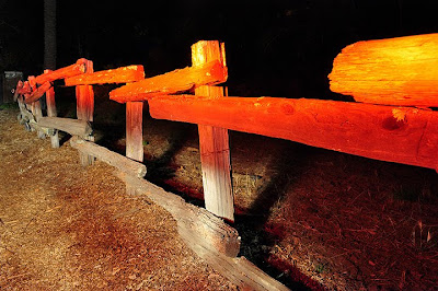
 Fence: Our goal was to control and differentiate light more precisely than we could with the trees. Thus we painted eight minutes of red on the upper fence and an extra two minutes of white on the lower fence, ground, and surrounding area. The results were hardly impressive, but they show promise. We now need to work on saturation and seepage.
In this image, over-saturation creates a jarring disjuncture between the top and bottom of the fence. The red (orange, really) is so thick, you can hardly discern the wood grain. We'll play with timing to reduce color-fill. We also want to avoid seepage. See how the fence posts sort of "drip" from orange to white? Taping some cardboard under the flashlight ("lidding" seems like a good term) might help. Our goal: control the intensity and placement of color.
Next Steps
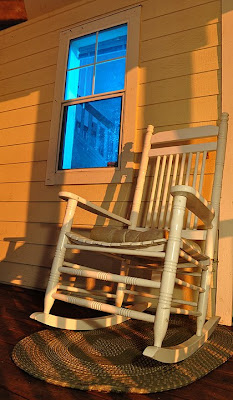
 Our next experiment calls for improved control color through structural lidding. In this process, one person will paint the exterior of a building with minimal white light, while another person coats a window in blue from the building's interior [first attempt added above]. This process should create a cool "television light" effect and, more importantly, demonstrate how we can use built obstacles and natural shapes to more precisely add color onto (and into) low-light spaces.
Discussion
During our first session, we encountered two non-artistic issues that merit further discussion.
Nighttime weather brings condensation and the attendant threat of camera damage. At one point when we observed drifting mist, we covered our equipment (though not the lens) with a plastic bag and, fortunately, no harm was done. Even so, we must research just how much natural condensation our newly purchased (and somewhat pricey) camera can take before we invite the future risk of electrical failure.
Equipment loss in low-light situations is a second issue we failed to anticipate. At night, it's surprisingly easy to misplace remotes, lens caps, and other small items. We didn't lose anything, but we did stress for a few frantic seconds when our clicker appeared to vanish in the darkness after I set it down in the grass. It's important to practice a consistent method of item storage, especially when distracted by arcane technical matters or lengthy exposure times.
Conclusion
We'll keep at it. So far, our images suggest that we're following a fruitful direction. And I can't wait for the next evening of spare time to try new techniques. My personal goal? To use light painting - perhaps aided by strobes and flashes, which may spread more intense color over wider areas - to evoke the sadness and spirituality of aging tourist courts, abandoned gas stations, and other relics of the automobile age.
Any advice? Post a comment. As the saying goes, "don't keep your light under a bushel."
(Photographs by Andrew and Jenny Wood)
No comments:
Post a Comment